Le Jardin
UX Project
Year
2025
For
UX Design Institute
Project Overview
The aim of this project was to design a responsive website for Le Jardin, a fictional boutique hotel nestled in the heart of Shoreditch, London. The hotel offers a peaceful, nature-inspired retreat from the city buzz, blending Moroccan riad aesthetics with modern simplicity. The goal was to create a seamless and intuitive booking experience that reflects the calm, relaxing atmosphere of the hotel.
This project was part of a course for the UX Design Institute (UXDI) and involved applying the full UX design process—from user research and analysis to prototyping and testing. The final deliverables included a clickable prototype, annotated wireframes, and a clear booking flow ready for handoff to UI designers and developers.
My Contributions
Everything presented in this case study was completed independently as part of my UXDI coursework. I was responsible for conducting all user research, competitive benchmarking, journey mapping, wireframing, prototyping, and usability testing. This is a research-led project with a focus on usability and problem-solving. In a real-world setting, the output would be handed over to UI designers for visual refinement and developers for implementation.
Research
Competitive Benchmarking
Online Survey
Usability Testing
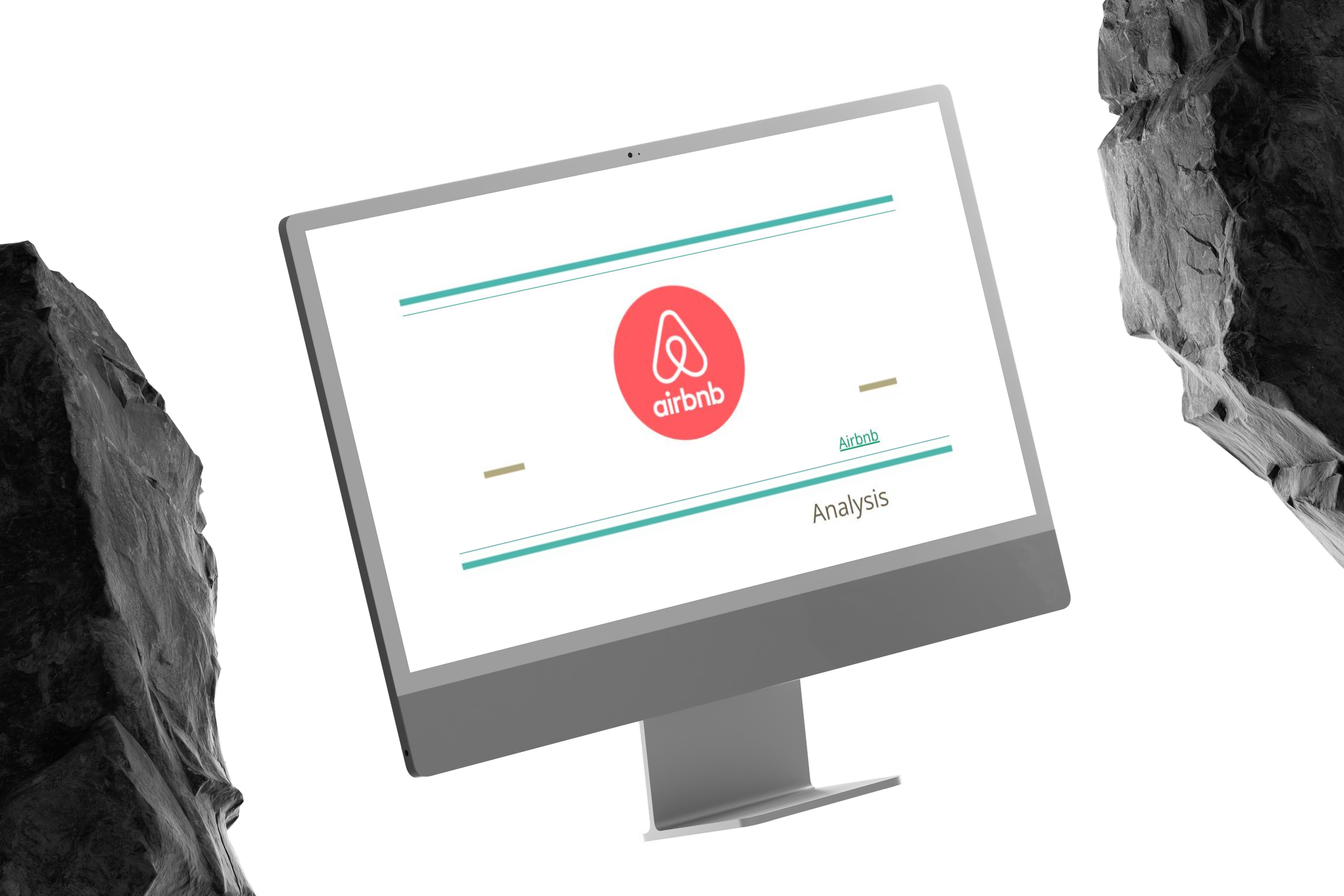
At the early stage of this project, before the concept for Le Jardin was defined, I conducted a competitive benchmarking exercise to explore how hotel websites across different categories structure their user experience. I reviewed and compared four distinct platforms: Airbnb, One Hundred Shoreditch, Nobu Hotels, and Premier Inn. The aim was to better understand how these websites solve common user problems, what usability standards they follow, and how they balance brand personality with functionality. This research provided valuable insight into design conventions and best practices that would later inform the direction of my own hotel booking experience.


Research
Competitive Benchmarking
Online Survey
Usability Testing
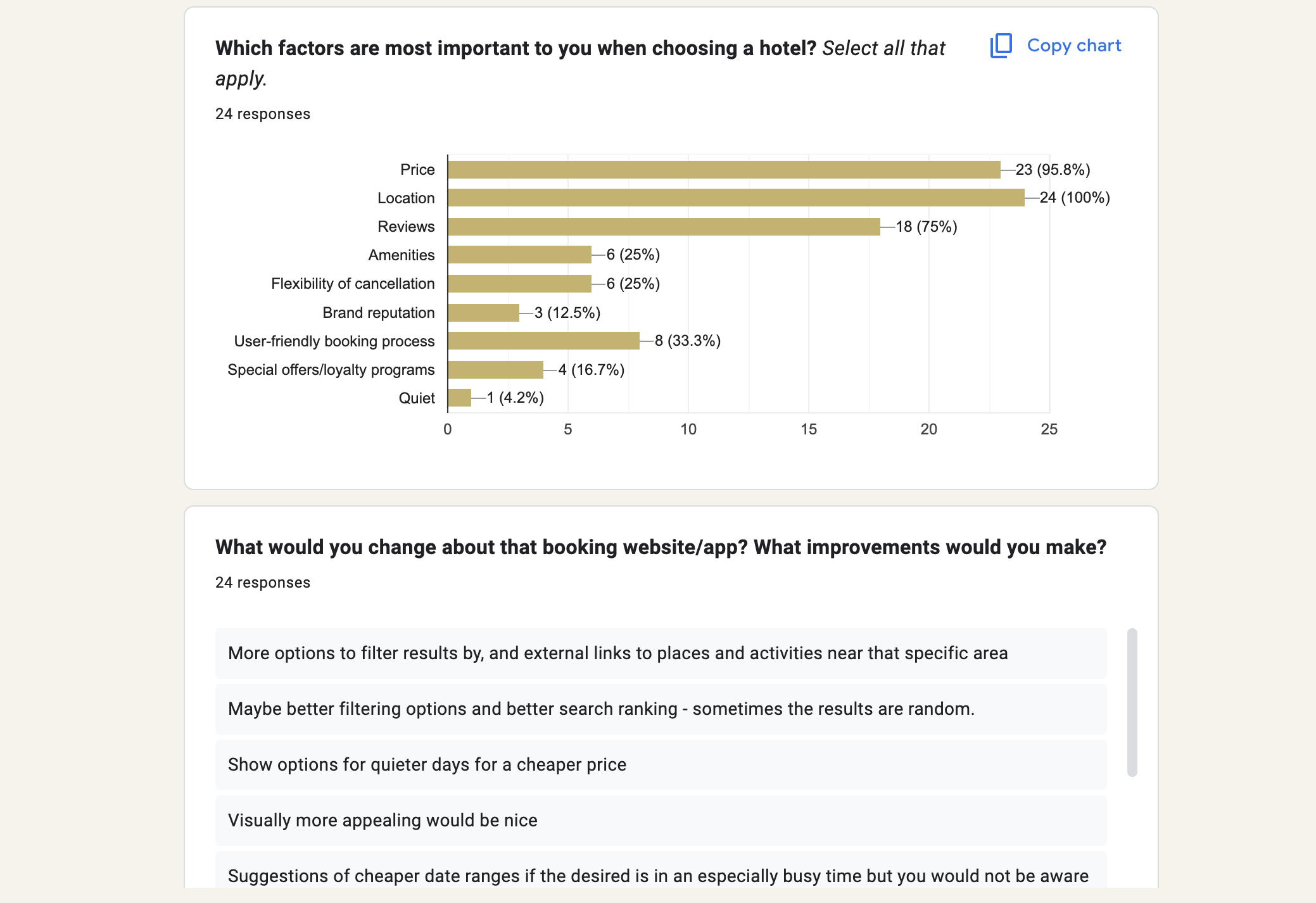
To gain insights into real user behaviors, preferences, and frustrations when booking hotel stays, I conducted an online survey targeting frequent travelers and hotel guests. The survey aimed to uncover key motivations behind booking decisions, understand pain points in the booking journey, and gather expectations around features, design, and functionality. The data collected provided valuable input for shaping user personas and identifying design opportunities that would make the experience at Le Jardin seamless, intuitive, and tailored to user needs.

Research
Competitive Benchmarking
Online Survey
Usability Testing
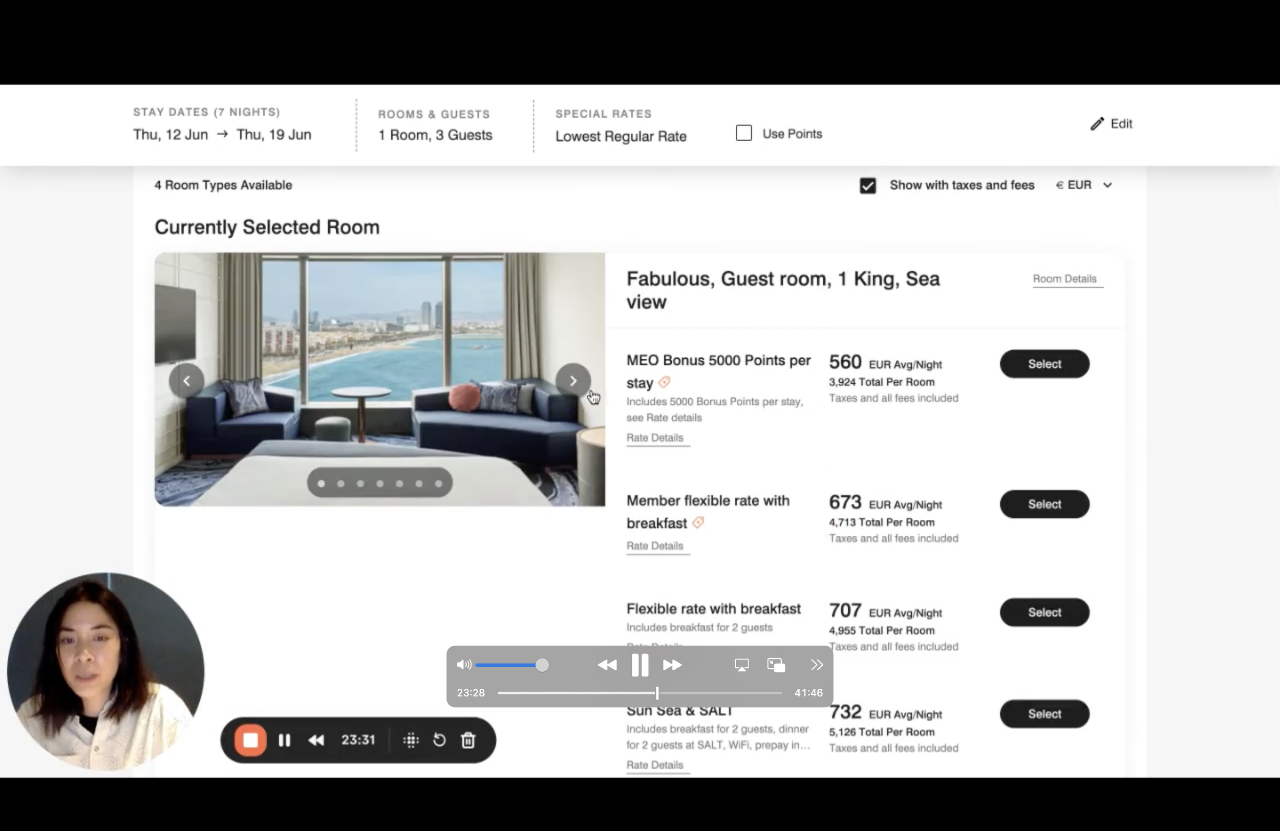
To evaluate how real users interact with hotel booking platforms, I conducted a usability test of my own and also reviewed notes from several previous usability tests. The goal was to uncover pain points, observe user behaviour in context, and validate assumptions about what makes a booking experience smooth and intuitive. Participants were asked to complete common booking tasks, such as selecting dates, choosing rooms, and adding extras. The tests stop righ before the payment process but I decided to take my own prototype further, until completion of the full booking process.
Here are some of the key findings that emerged from the usability tests:
Clear, linear booking flows with visible progress indicators reduced friction and improved task completion.
Persistent, editable booking inputs (dates, guests) increased confidence and reduced error risk.
Progressive disclosure prevented overwhelming users by revealing details only when needed.
Strong visual hierarchy balanced rich imagery with high-contrast CTAs to keep users focused.
Transparent pricing early in the booking journey built trust and reduced hesitation.


Analysis
Affinity diagram
Customer journey map
To make sense of all the information gathered during the research phase, I created an affinity diagram. This process involved mapping out all the insights from competitive benchmarking, surveys, and usability testing onto sticky notes, then grouping them into themes based on similarity. By organizing the data visually, I was able to identify recurring patterns, user needs, and pain points more clearly. These clusters of insights became the foundation for defining priorities and guidelines that would directly inform the design phase.


Analysis
Affinity diagram
Customer journey map
To better understand the end-to-end experience of booking a hotel online, I created a customer journey map. This allowed me to visualize the different stages a user goes through — from discovering the website, exploring rooms, and selecting dates, to adding extras and completing payment. By mapping user goals, actions, emotions, and pain points, I was able to identify key areas of friction such as lack of transparency around pricing and limited visibility of add-ons. At the same time, the map highlighted opportunities to create moments of delight, like a simple and intuitive date picker or a clear booking summary. This journey map served as a valuable foundation for prioritizing design decisions and ensuring that Le Jardin’s booking flow was both seamless and user-centered.

Design
Flow Diagram
Interaction Design
Prototype
Wirframes - Annotations
To translate insights into structure, I created a flow diagram that mapped the step-by-step process a user takes when booking a room on Le Jardin’s website. This diagram helped define the core pathways, from selecting dates and choosing a room type to adding extras and completing payment. By visualizing the logic behind each decision point, I was able to simplify the flow, reduce unnecessary steps, and ensure that users could always understand where they were in the process. This became an essential blueprint for the wireframing stage, guiding a smooth and intuitive booking experience.

Design
Flow Diagram
Interaction Design
Prototype
Wirframes - Annotations
With the booking flow defined, I moved into interaction design by sketching every key screen of Le Jardin’s website. This stage allowed me to explore layout ideas quickly, test different approaches to navigation and content hierarchy, and ensure that each step of the booking process was clear and consistent. By keeping the sketches low-fidelity, I could focus purely on structure and functionality before moving into wireframes and higher-fidelity design.


Design
Flow Diagram
Interaction Design
Prototype
Wirframes - Annotations
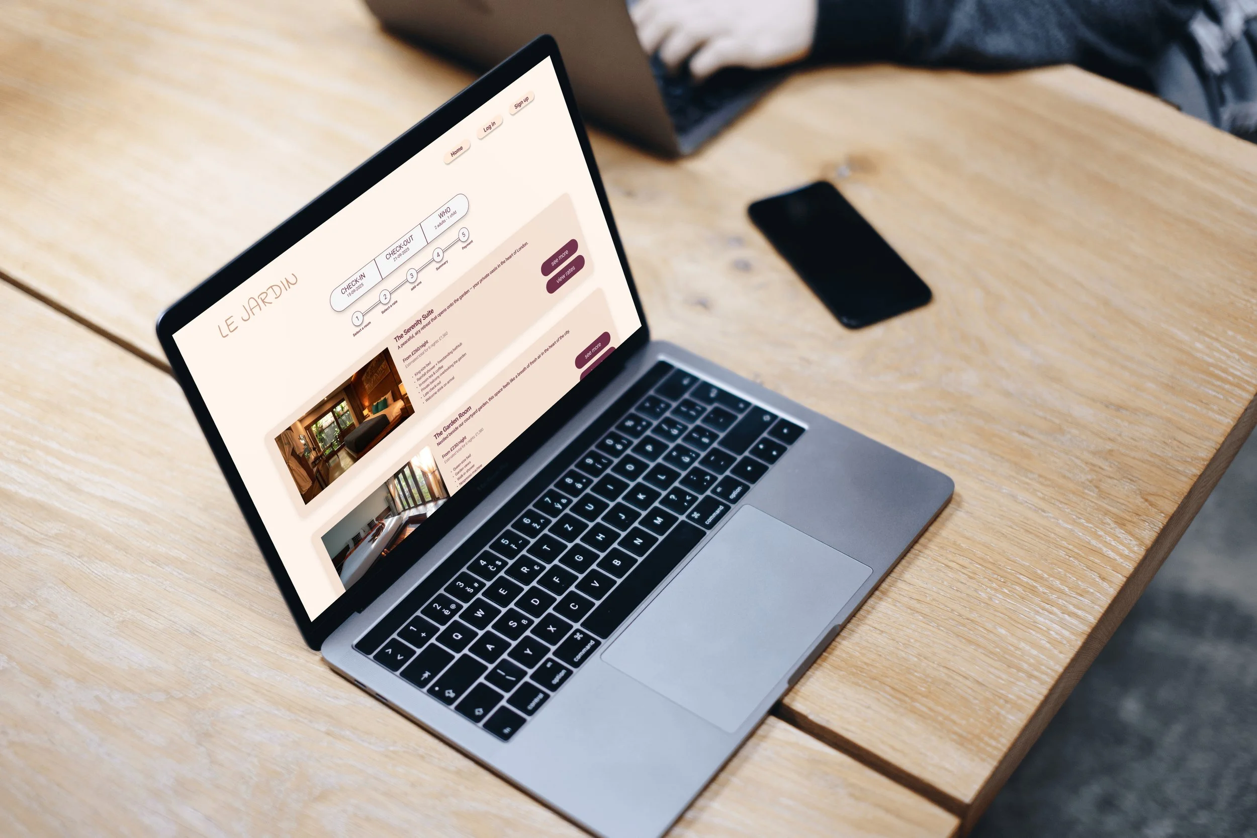
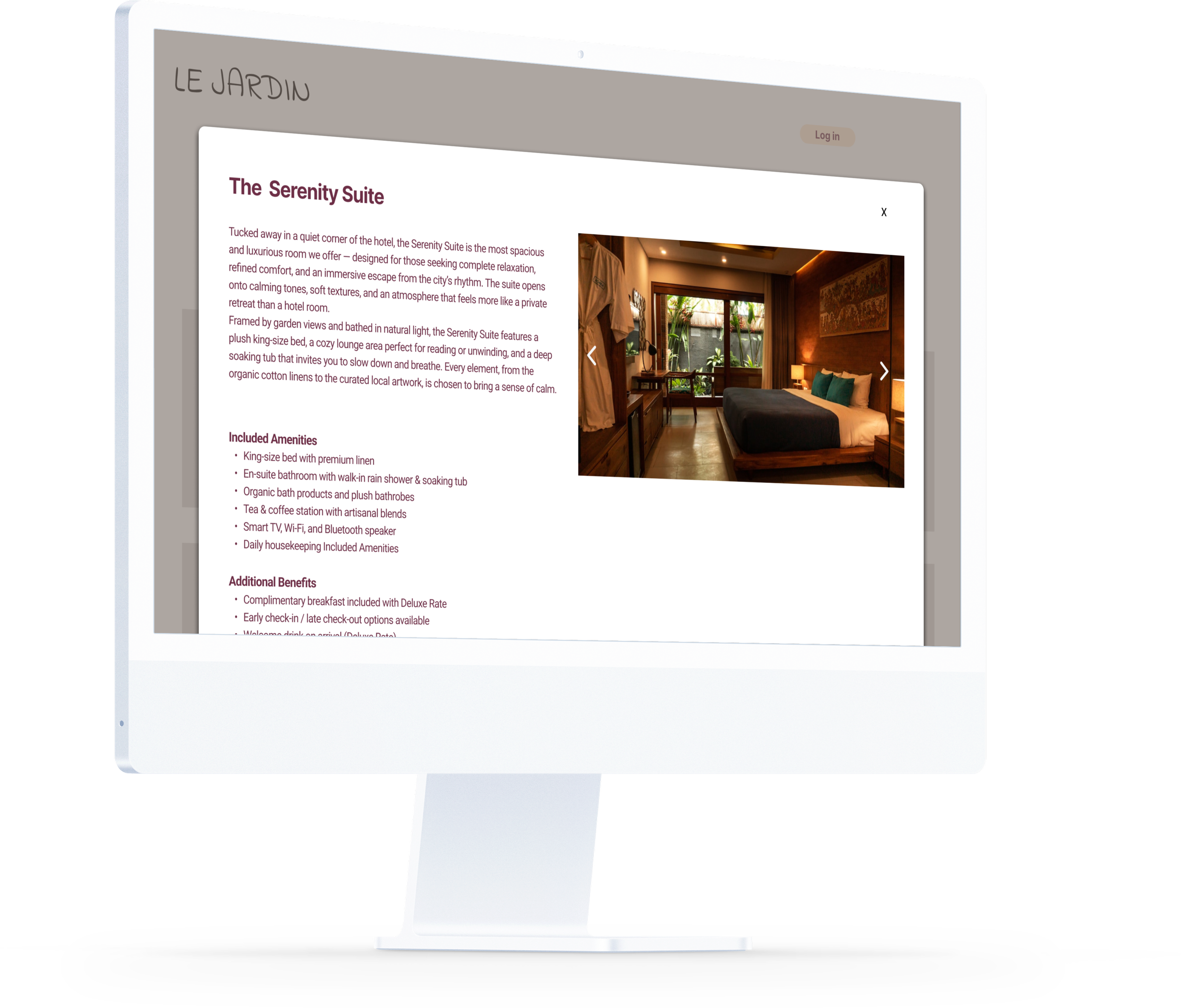
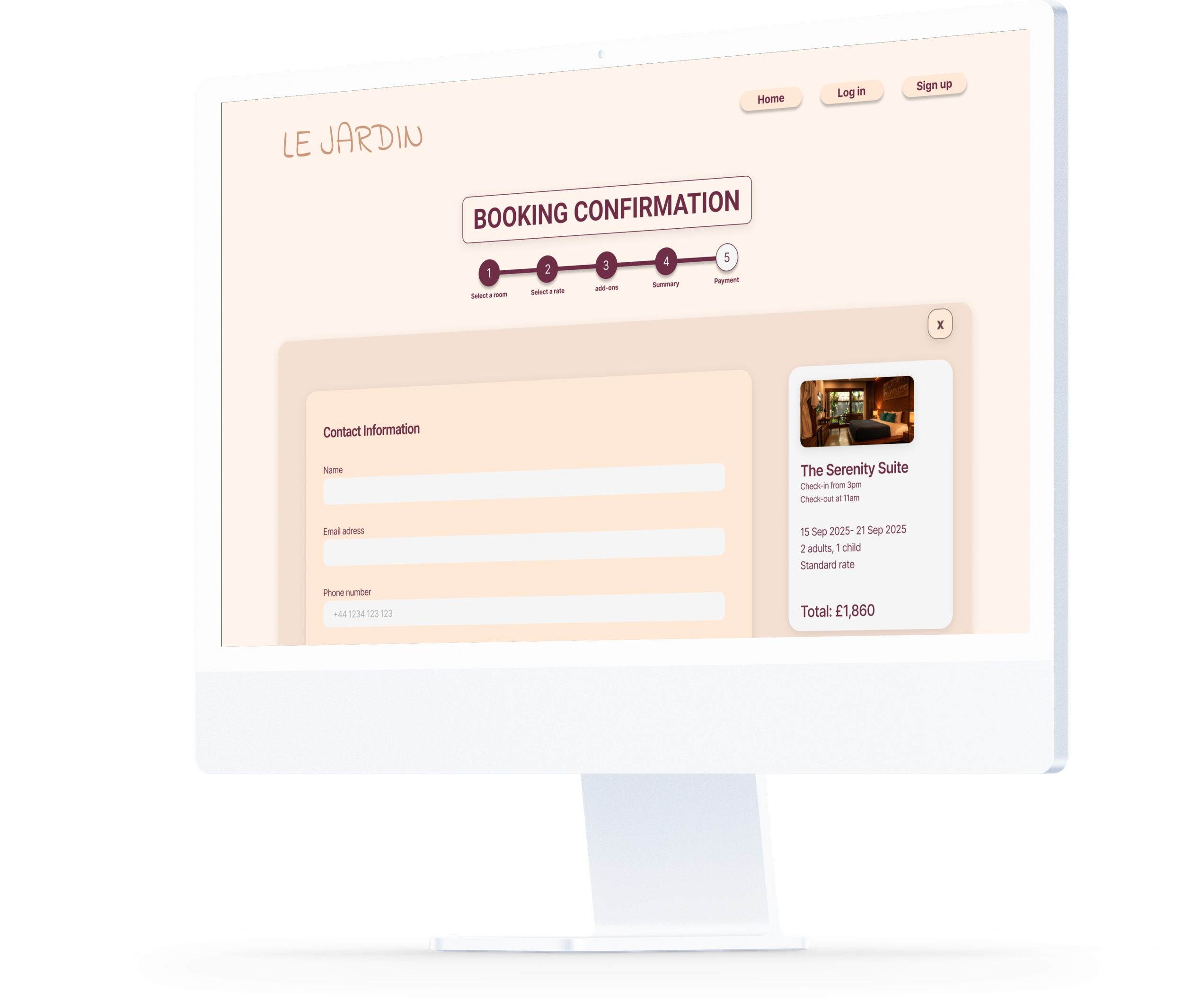
After finalizing my sketches, I moved into prototyping. While the course requirements focused on building a medium-fidelity prototype, I chose to create a high-fidelity version instead. My goal was for Le Jardin’s prototype to feel like a real website — combining strong visual design with clear, user-centered interactions. This approach allowed me to showcase not only the usability of the flow but also how the overall look and feel could support a seamless booking experience.
Design
Flow Diagram
Interaction Design
Prototype
Wirframes - Annotations
The final step of the project was to produce a complete set of wireframes with detailed annotations. This stage was about bridging the gap between design and development, ensuring that every interaction, input field, and state was clearly documented. I used Figma comment pins to specify behavior, validations, and design decisions, so developers could easily understand not just what to build, but how it should function from a user’s perspective. These annotations acted as the “instructions manual” for the product, making the design handoff seamless and leaving no room for ambiguity.
Let’s work together!
If you like what you see and want to know more, get in touch! I’d love to hear from you!